A well-written text+images version of their GDC 2013 talk.
TL;DR: A couple of things that jumped out at me:
- The total dev team for Skyrim (TES 5) is 90 people (less than normal for this size game)
- Oblivion (TES 4) had a mere 45 staff!
- They strategically embrace modular levels as the way to produce enough content in time
- …Added together: explains the recurring Art problem in Elder Scrolls games, where after an hour or so everywhere starts to look very similar
- …NB: while I resent that (and I know many people who won’t play the games, they hate it so much), the tradeoff is IMHO worth it: broad story-content in a huge world. So it’s a big loss, but a compromise I’ve always been willing to accept as a player
- …in the article, they call this “art fatigue”
- Allegedly only in Skyrim (but … I’m sure I saw this in Oblivion too), they put arbitrary-rotated wall segments inside rooms to break the sense of “rectangular” walls everywhere. They called this “Shell Based” building
- “It’s common at the start of a project to strongly associate a particular setting with specific types of inhabitants or gameplay. You may want to only see soldiers in military bases, and zombies in crypts, for example. Resist this.”
- …IMHO: obvious (it’s basic art-composition theory), but worth pointing out to anyone non-art background looking at game and level design
- There was some pushback in the team against mix/matching modules from different kits: “The notion of [an artist’s] art being used in unforeseen ways could lead to bad intersections or lighting issues, for example.”
- …Stupid of me, I’d never thought about how the team artists would react to this kind of mix/match (the only games I’ve worked on with modular art kits … were 2-3 person indie projects, so the atmosphere was very different)
- …This also explains a *lot* of the geometry bugs in TES games (where you get stuck in angles of the wall, temporarily, or items drop in places you are blocked from reaching for no apparent reason): the combination of assets wasn’t designed-for / tested-for, so there were bajillions too many combinations to test!
- “when you’re trying to identify somebody with the the aptitude and interest to be a great kit artist, you’re basically looking for a unicorn. They’re rare.”
Art Fatigue
The author initially cites this with respect to:
“the same rock or farmhouse or tapestry used again and again. And another two dozen times after.”
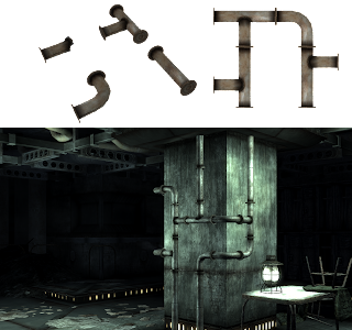
…IME, that’s not the problem at all. The problem is that every internal environment appears to have bought their walls, floor, and ceilings from the same branch of Viking Ikea ™. As demonstrated in the screenshot of “blatantly modular pipes” in the article:
…and when talking about Oblivion, it sounds like my experience was reflected in their testing with large groups of players too:
you’re more likely to pick up on repeated clutter first, then the repeated architecture. This is especially true in actual gameplay from a first-person perspective. To minimize needless repetition, we abolished the use of warehouse cells as they existed in Oblivion.
To be honest, I’ve long been surprised that Bethesda stuck with “square-based grids” for so long (other games were using non-square grids decades ago). As one of the commenters points out:
Square meshes and ‘cubic’ tile-blocks on naturalistic indoor environments (eg natural caves) can be a challenge – how about equilateral triangular meshes, or for 3d space rhombic-dodecahedrons? – Xu En
Common AAA art/design/level-design problem: handoff
This is rarely written about but the kind of thing that Leads, Producers, EPs and Project managers spend ages dealing with:
“They’ll do an art pass and make the level visually appealing Once they’re at a place they’re happy with, they send it back to design for final markup and scripting. Once design has done that, the level should theoretically be done – right?
Not usually. Level designers often inherit a litany of unforeseen problems when receiving final art for their levels. Cover along a street has been converted into poles too thin to take cover behind. A wall intended as a visual blocker is now a see-though chain-link fence. A bridge now has support beams which occlude sight lines in a major gunfight you had planned.”
(my emphasis)
Common level-design problem: reference sizes
Obviously, you need to know how “tall” your characters are. But how do you translate that into a practical measurement when working on a scene?
“One thing we’ve found very useful is to determine a uniform dimension for door frames. This has a few benefits. It allows us to transition from kit to kit without unique pieces, as well as allowing easy re-use of doors between kits. More importantly, it gives AI and animation a fixed standard to work from, which can be reinforced throughout the game.”
A little bit of the Agile/Scrum mindset
Some of their approach is inherently Scrum:
“we get our kits to a “functional-but-ugly” state as soon as possible”
“The level designer should be constantly stress testing throughout these stages. The artist should deliver pieces as soon as they are even rudimentarily functional, and the level designer should use them in non-ideal conditions. ”
They don’t go into detail, but imply that this has caused a lot of friction in the past with individual developers who found it emotionally difficult to work in this way. I would have liked some more info on that – dealing with this kind of “mindset” issue on game teams is a major challenge.